Built to
Stand Out.
Built to
Stand Out.
Before we design anything, we talk.
What kind of work do you want more of?
Where is the business heading?
What does “good service” mean to you?
We listen carefully — because branding only works when it’s aligned with the business behind it.
When the story is clear, the visuals follow naturally.
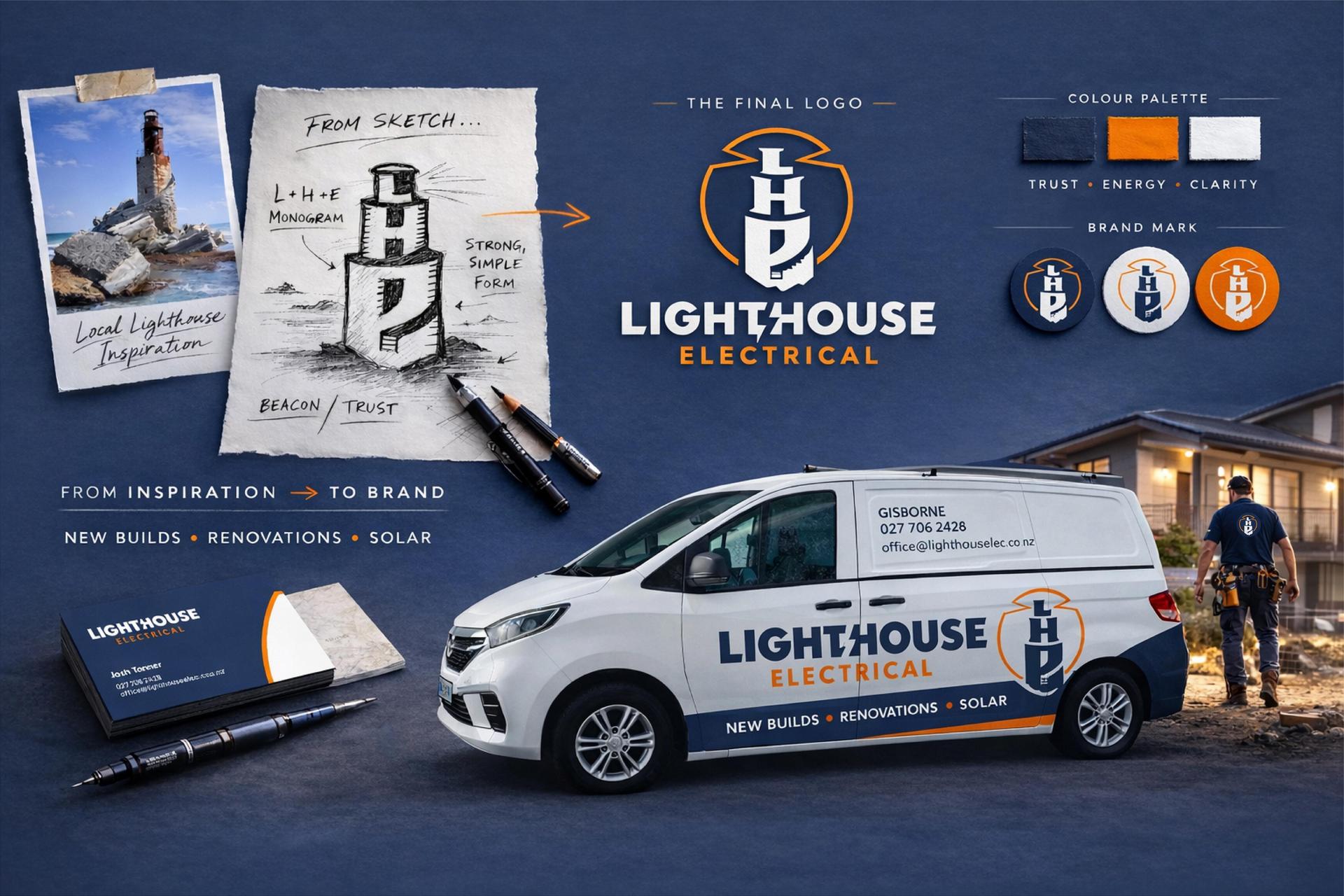
With direction set, we build the identity.
Logo. Colours. Typography. Layout.
Everything is designed to feel strong, clear, and practical — not trendy for the sake of it.
For tradies especially, branding must work in the real world:
On vehicles. On uniforms. On site signage. On invoices.
If it doesn’t work on a van, it doesn’t work.
Once approved, we prepare everything production-ready.
Vehicle signage files.
Print-ready artwork.
Uniform layouts.
Web assets if required.
Because branding isn’t finished when the logo is approved —
it’s finished when the business is visible and ready to grow.
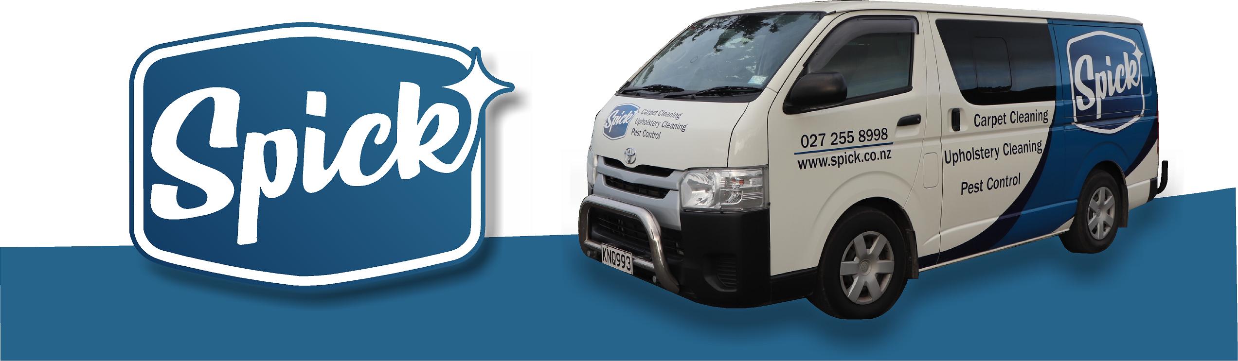
When SPICK stepped away from a market-leading franchise, they needed more than a logo — they needed an identity of their own.
We developed a name that was short, memorable, and instantly connected to the cleaning industry. Although initially hesitant, the owner recognised the power of a name that would stick in customers’ minds.
The brand direction focused on old-fashioned service — dependable, honest, and professional. To reflect this, the logo was designed with a retro service patch aesthetic, reinforcing trust and reliability.
The result was a confident, independent brand — rolled out across vehicle signage and marketing material — that immediately attracted positive feedback and established strong roadside presence.